Stephen Spencer (UX Design Lead)
Jeff Bazarko (Product Manager)
Marshall Wang (UX Researcher)
Overview
In the summer of 2024, I joined Roku's UX Team as a product design intern, exploring the UI/UX for Roku's first Widget Ambient Screen.
The purpose of the project is to create a personal daily experience that brings more click-through and exposure rate with Roku apps and partner contents.
The scope of the project is to conduct 0-1 exploration on widget

Design Highlights
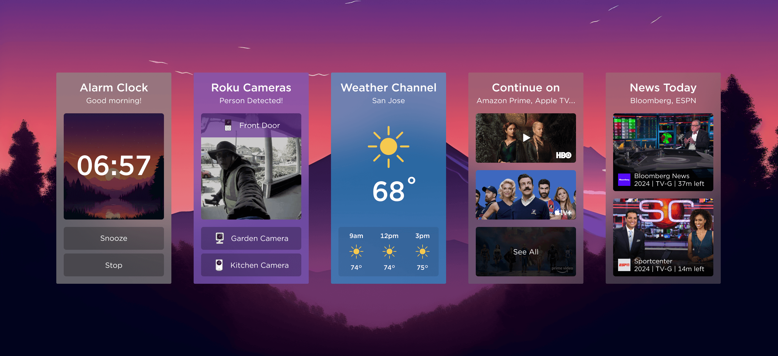
An ambient screen with easy access to app functions
Waking up with Roku TV
The TV slowly lights up in the morning, showing a peaceful scene. The alarm widget pops up gently, creating a smooth and calming wake-up experience.
Variety of Apps and Modular Widgets
Customizing experience with a variety of apps and modular widgets, giving users flexibility and control over their TV interface.

Context
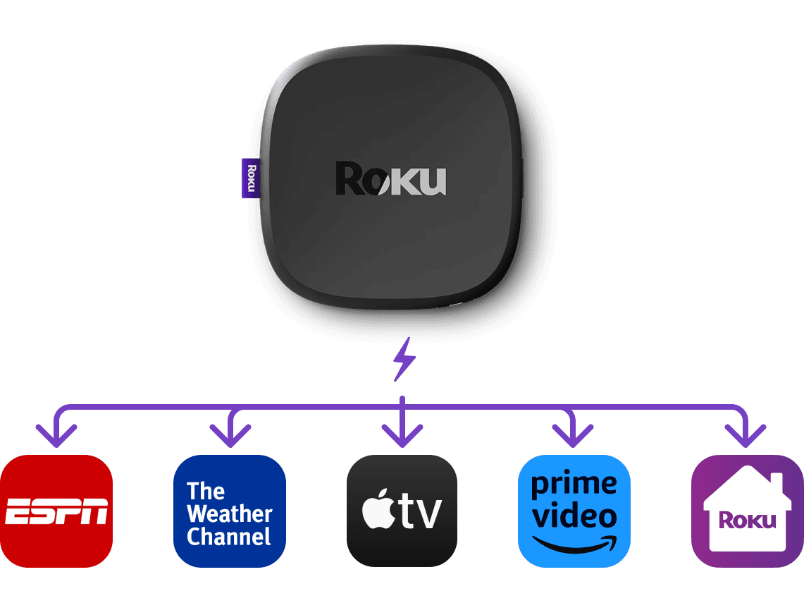
The project comes from an update in the hardware
A powerful new player
Roku's new player provides capacity to drive multi-screen functions. Users have the opportunity to have split screens for different applications at the same time.
The goal of the project is to…
Increasing user’s time spent on Roku's new ambient mode

Promote partnered channel content and Roku Apps

Problem Space
Learning from our competitors
Users are confused about the setups

The current TV widgets from other brands have complex setup process. Users are having a hard time customizing their screen


Solution
A solution that satisfy the goals and solve the problem
Solution 1: Simplified User Flow
Increase user’s time spent on platform

Reduce the cognitive load when using widgets

Simplified user flow & interface
Solution 2: Simplified Setup
Complex setup process for customized screens
Reduce the complexity in setting up widgets

Intuitive setup process for widgets
Solution 3: Modular Templates

Promote partnership and Roku content
Reduce the difficulty in creating new widgets

Modular templates for easy partnership
Solution 1:
Simplified User Flow & Interface
A consistent experience with Roku
The design stays consistent with the current design system & interaction, reducing the learning curve for this new feature.

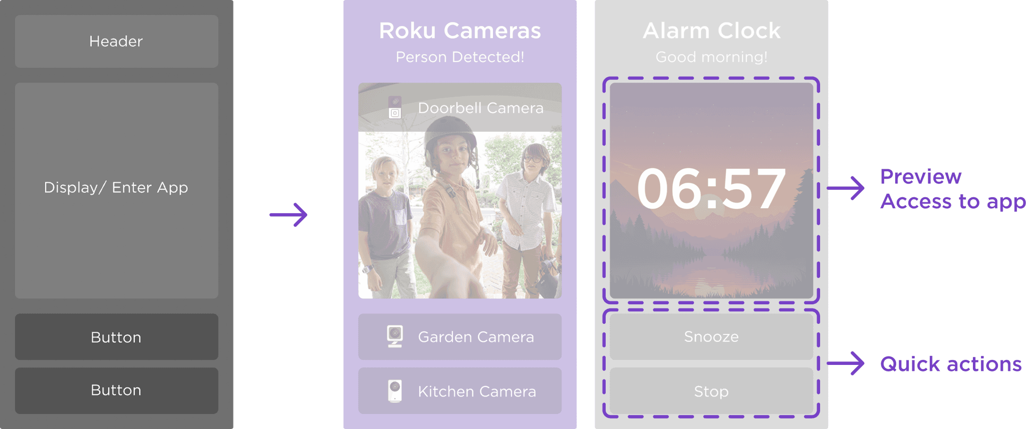
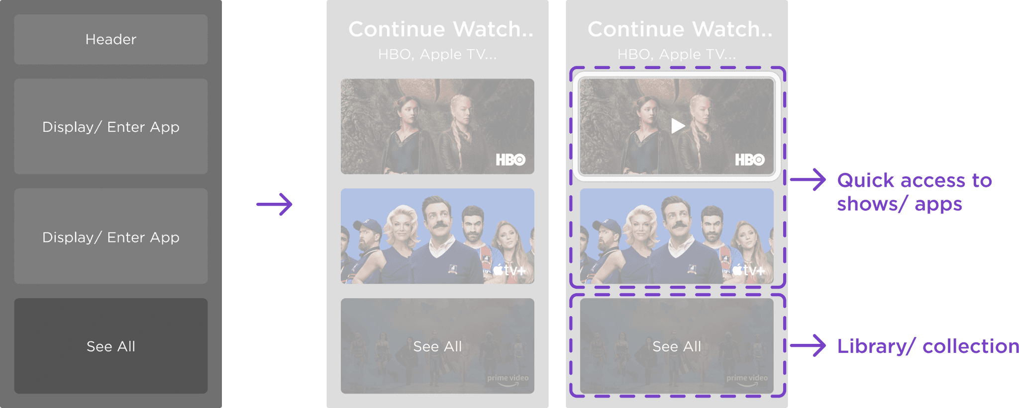
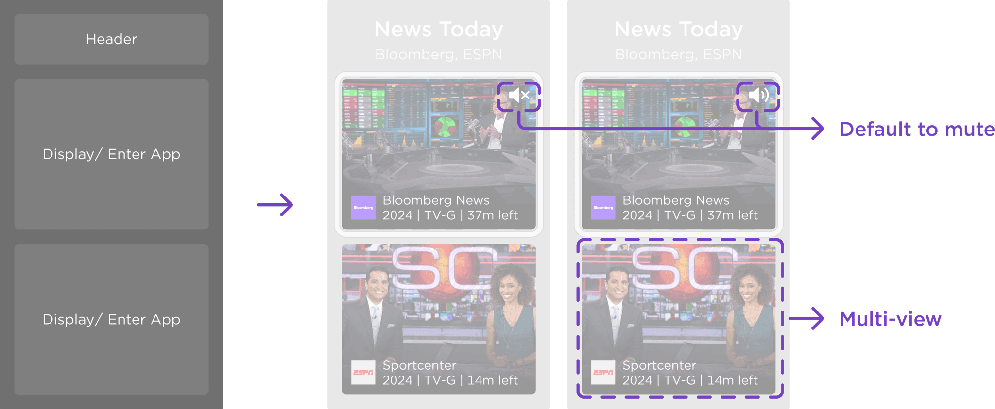
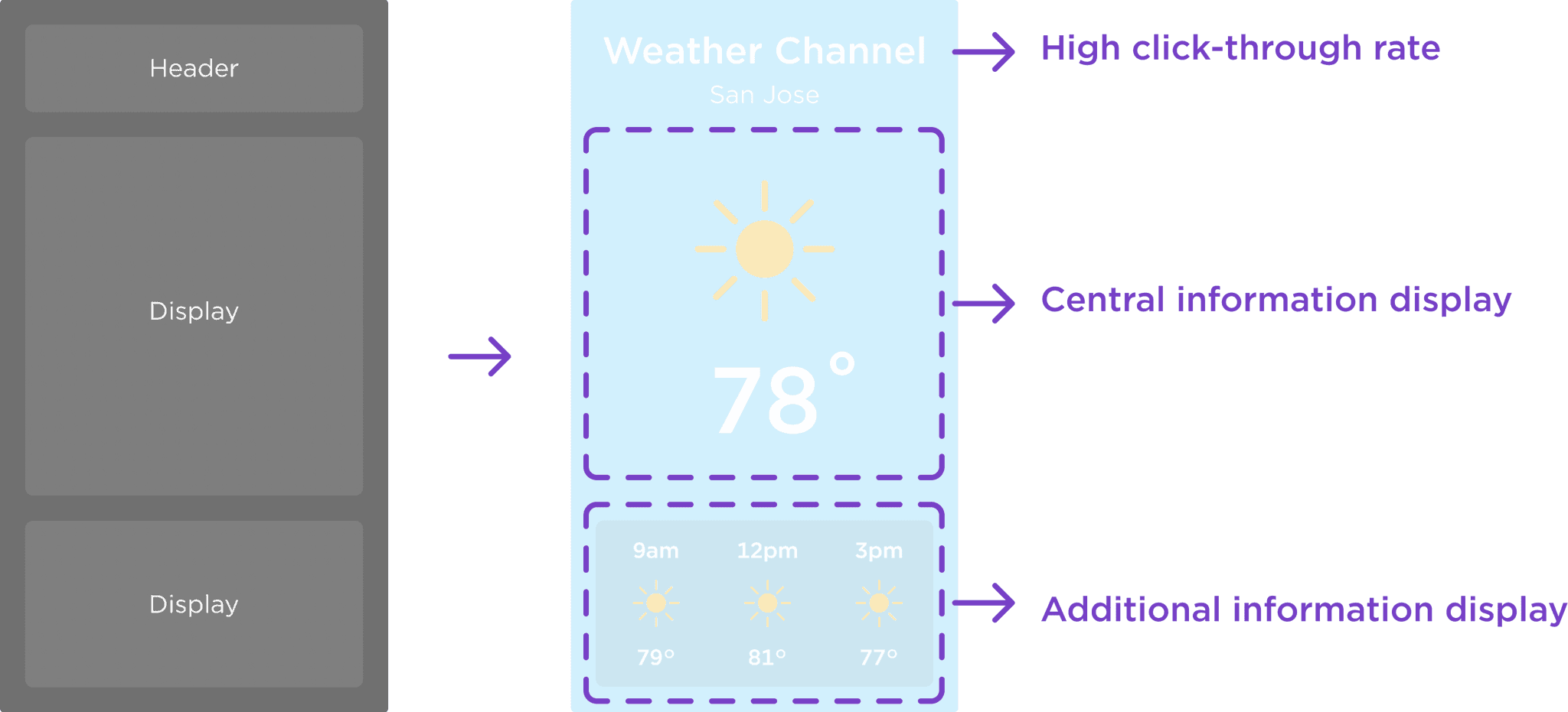
Similar interaction with current home screen design, low learning curve
More interaction available within widgets
Flexibility in widgets types, providing various options within the same form
Design details
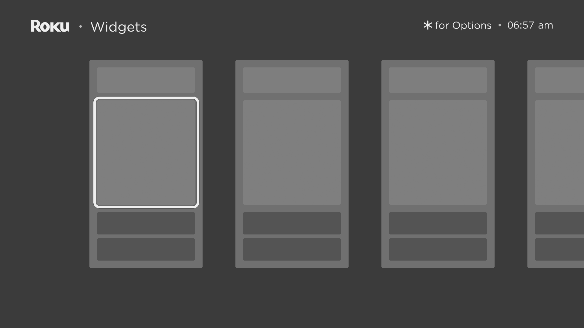
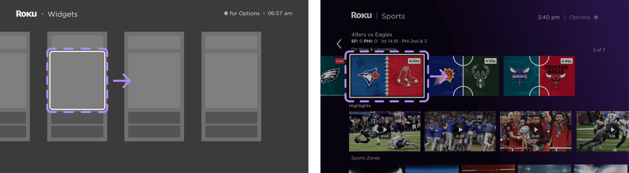
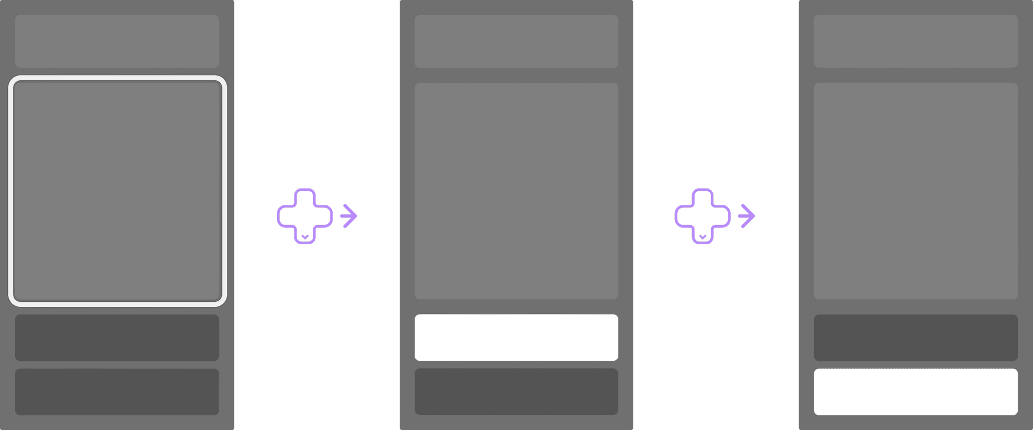
Fixed focus box, movable carousel
Keeping focus box fixed to maximize the information displayed by the row
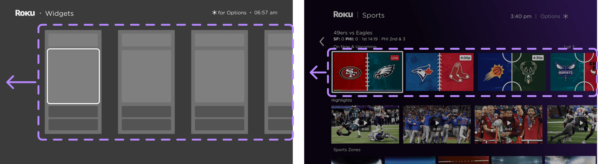
Fixed carousel, movable focus box
Focus box only moves in the end of the row to avoid empty screen
Ups and downs for in-widget interactions
Transformation in focus box and highlighted cta to align with the current design system
Additional iterations
Unified small size widgets
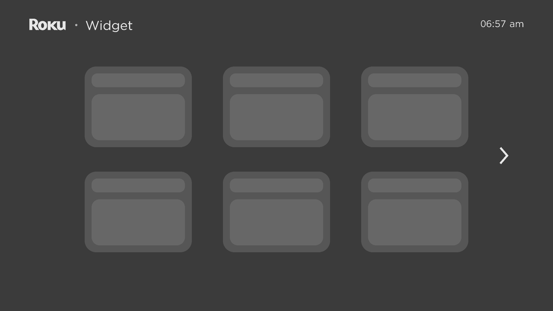
Feedback
Able to display more widgets on one screen page, prioritizing most used widgets
Easy to build a uniformed template

Less interaction with widget
Additional steps to reach second page
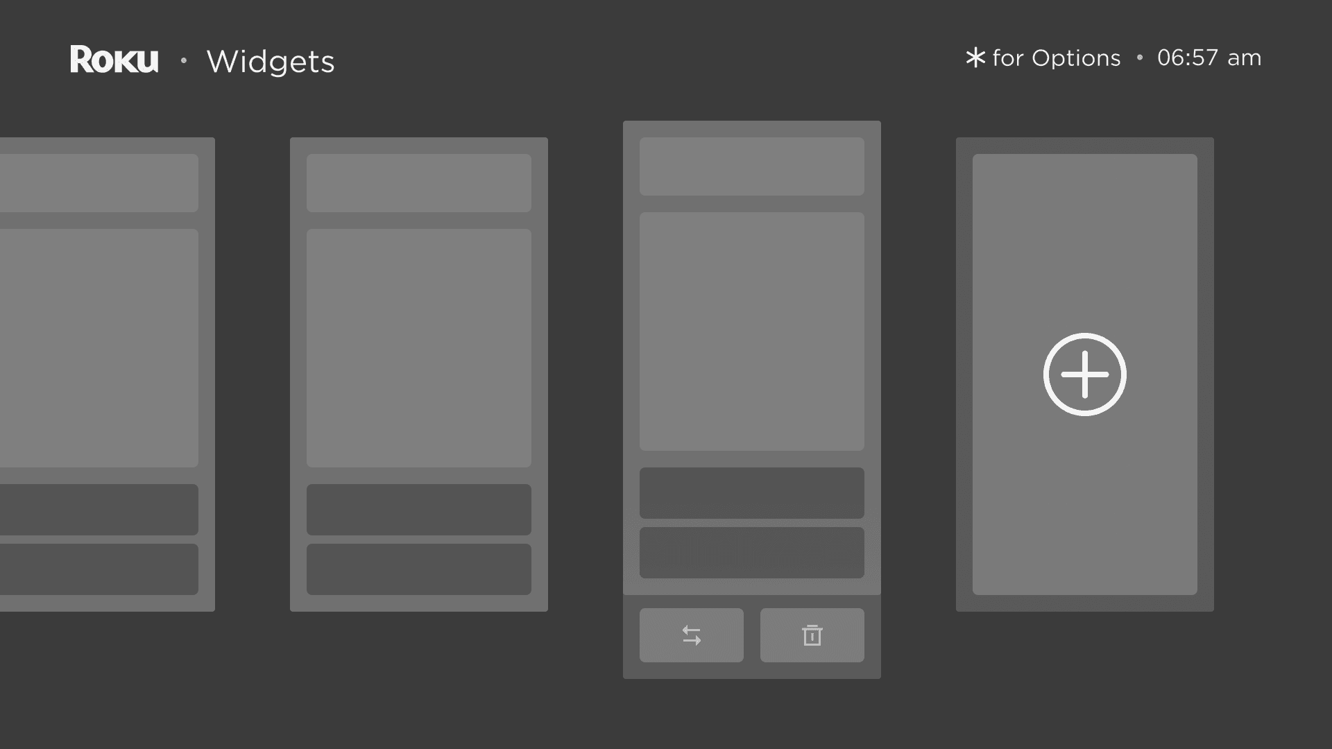
Flexible largest size widgets
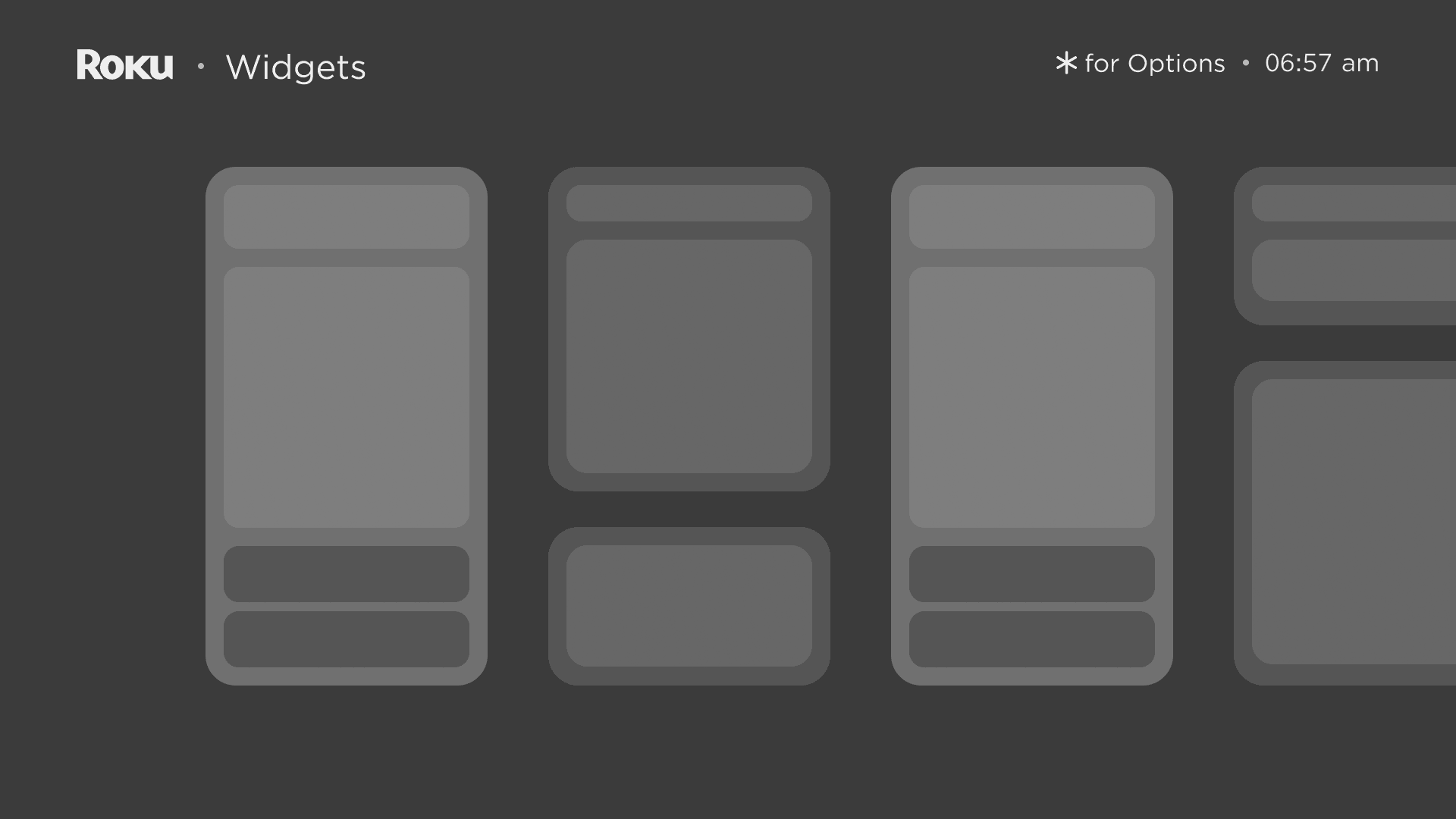
Feedback
Similar interaction with current home screen design, low learning curve
More flexibility in widgets types
More interaction available within widgets
Difficult to build a one-shot widget
Solution 2:
Simplified Setup Process for Widgets
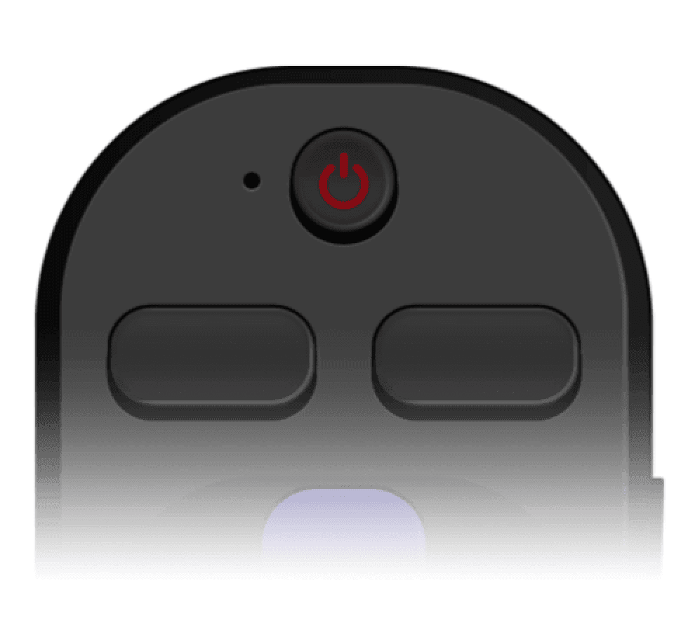
One button away from setups
The design employs * as the optional setup button, ensuring the freedom of customization with a simple click.
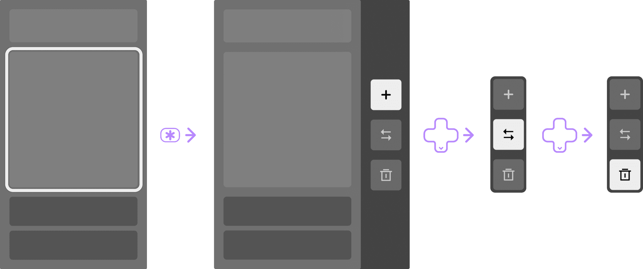
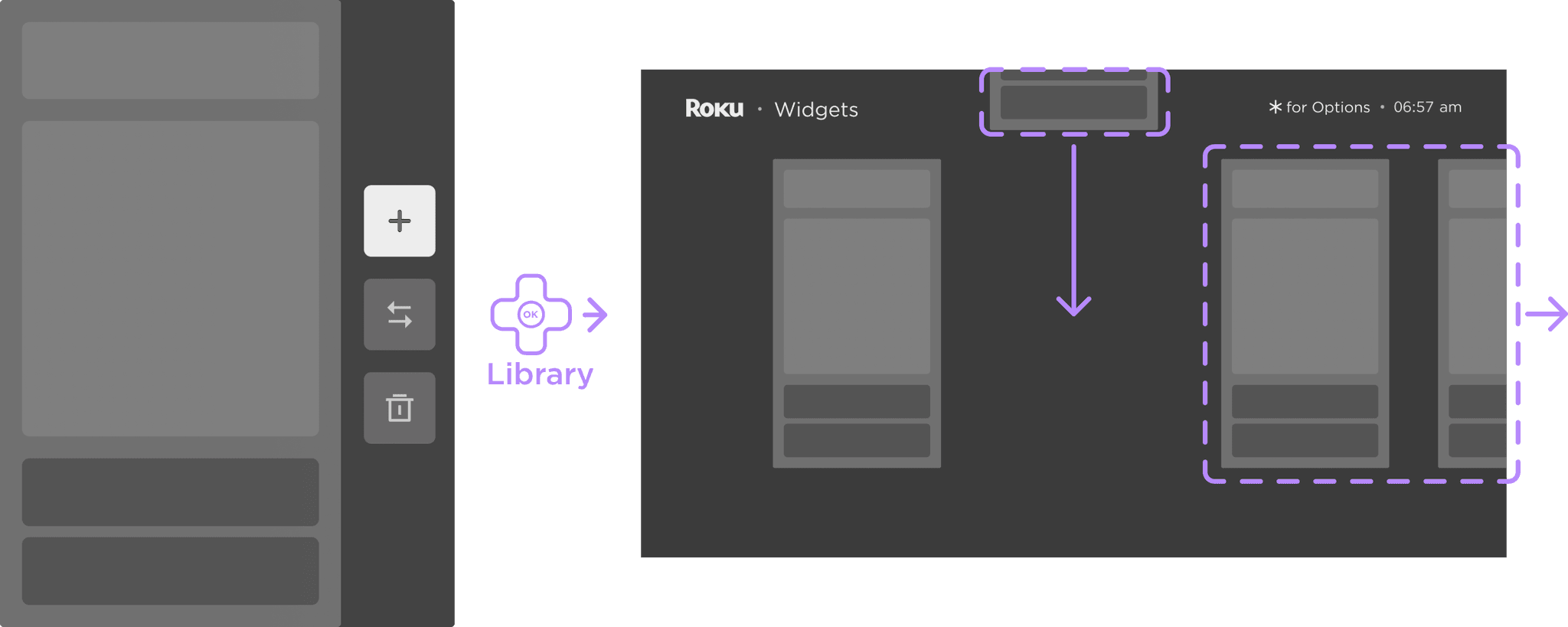
Adding from the top
Adding button takes user to widget library with options to add any available widget.
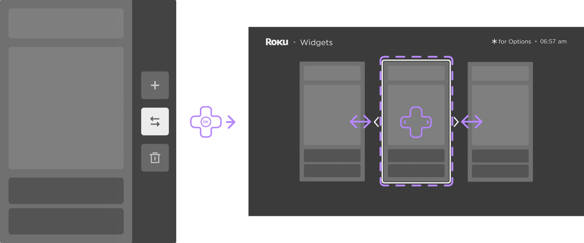
Rearranging the widget
Rearranging buttons activate widget moving mode with indication of moving direction assets.
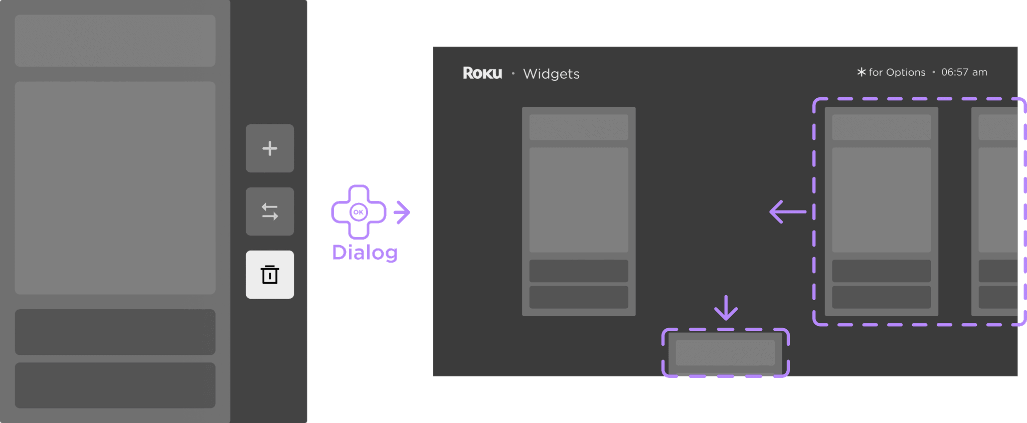
Exiting from the bottom
Deleting button takes user to delete dialog of either confirm removing widget to library or cancel.
Additional iterations
Bottom drawer & widget addition
Feedback
Widget adding option only shows up until the end of the carousel list
Editing option control being separated into add and rearrange+delete
Side drawer with all three controls
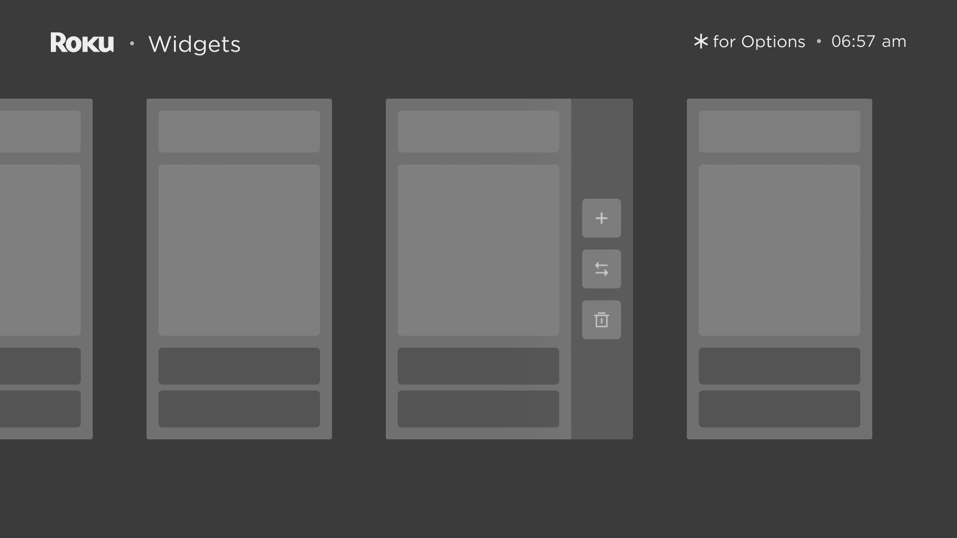
Feedback
Least step to editing widget anytime with all the control options at one place